
PROJECT
task U - Schedule Managing App
OVERVIEW
Transitioning back to normal lives after a year of remote learning has created a sense of depression and uneasiness for many Rutgers students, professors, and faculty members. To support their personal, and academic well-being as well as their good mental health in day-to-day lives, the university is exploring ways to support them by providing a sense of belonging to a community. Our main goal for this project is to discover and understand each student's struggles and provide a leveraging technology that can promote their academic and personal well-being.
TEAM
Pixel Chinks
TIME
One-Week Design Sprint
TOOLS
Figma, Illustrator, Photoshop, Miro
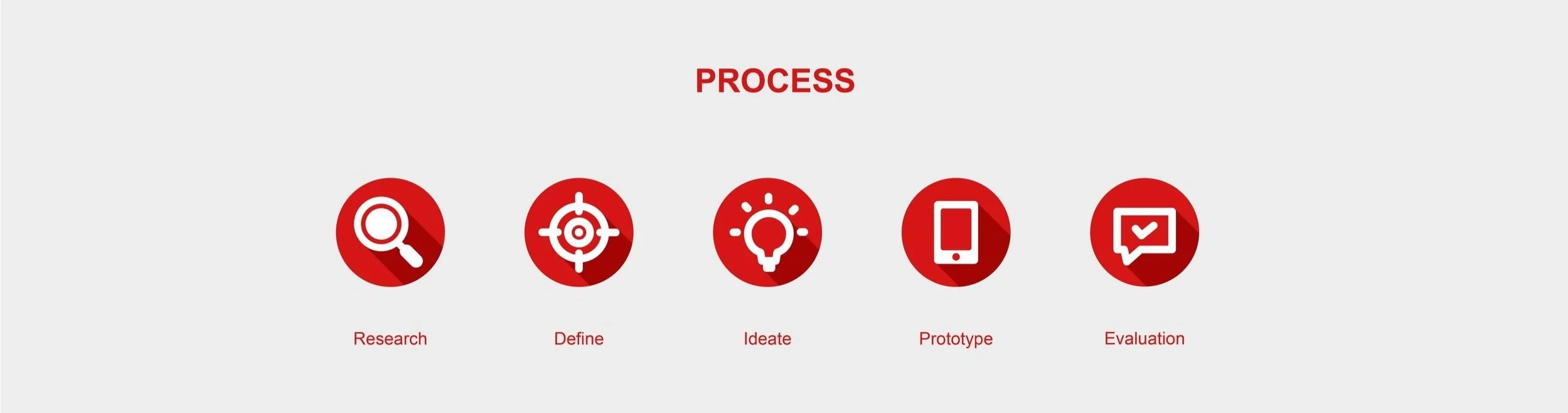
USER RESEARCH
To understand and learn more about users' difficulties and needs, our team conducted interviews. Because the main target user of this project is Rutgers students, the interviews were held on Rutgers's college avenue campus including the student center and outdoor community space.
During the interview, we asked students three main questions, which are:
What causes you stress with school and life?
What do you do to maintain your mental and physical well-being?
How has the pandemic changed your mental and physical well-being? (Is it Better? Or is it worse)
Besides these questions, we also asked the following questions such as "what makes you happy?" or "How do you keep connected to Rutgers?".
PROBLEM
We had a chance to speak with 16 students in total and the outcome was very similar yet distinct.
Through the research, we realize that most of the students are very stressed and having difficulties managing their time with so many assignments and tests. The good point was that students know how to release those stresses in their own way such as by working out, eating healthy, or meeting friends.
However, although they all knew how to combat their stressors, they weren't sure how to stay on track and hold accountable for their academic and personal goals.
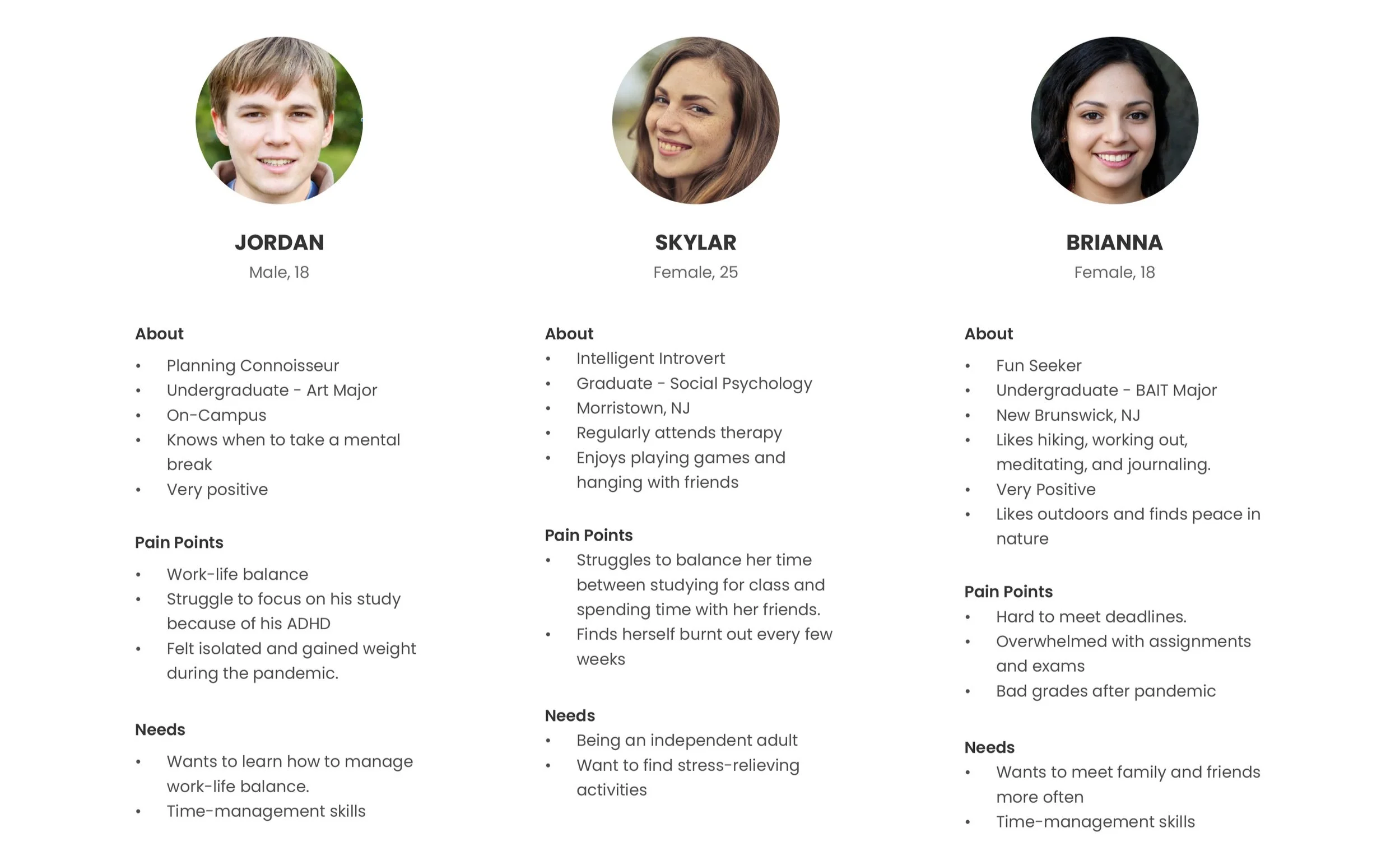
USER PERSONAS
To understand target users better, we wanted to determine the pain points and needs from the user’s perspective. So, we combined all these user types based on the interview into three main provisional personas, Jordan Skylar and Brianna.
JOURNEY MAP
Among them, we are focused on Brianna and made a journey map that shows Brianna's daily life as a Rutgers university student. As we went through Brianna’s real-life event, we could also feel Brianna's stress and anxiety as a college student. However, it was also a great opportunity to find key insights as well as some possible opportunities to can be uncovered.
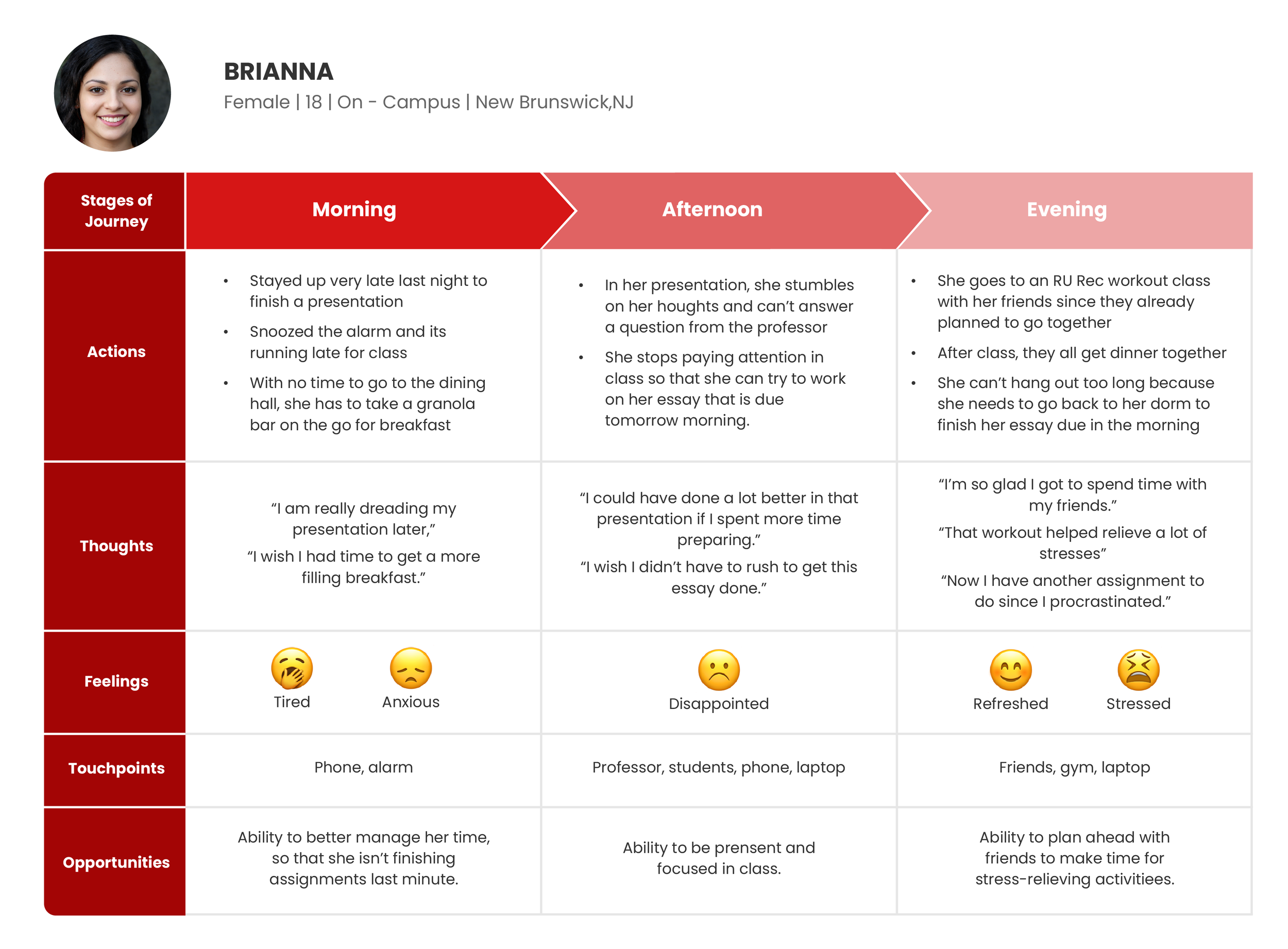
Brianna shows that she is so busy and stressed with endless homework, tests, and bad time management. However, her stress is relieved and motivated when she is together with her friends.
This represents that the connection between the students can provide a positive impact on their mental health.
IDEATION
After narrowing down our target user group and their frustrations, we started to brainstorming process to come up with solutions for each of the users’ problems.
SOLUTION
After brainstorming the idea, each of the team members came up with various solutions and wireframes. However, we noticed that there were some similarities in key features and functionality that every team member came up with.
We combined all the major ideas together and concluded that we wanted to build a service that
Informs students about school events,
Keeps students accountable for their plans, and
Connects them with friends and the community.
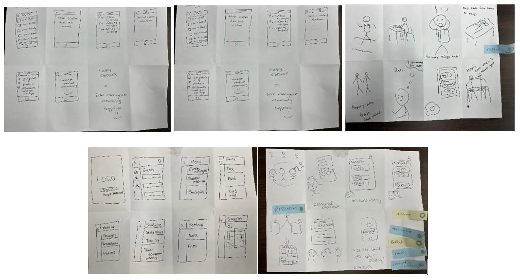
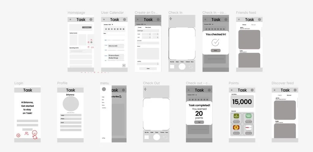
WIREFRAMES
With the key features we concluded, our team started to build wireframes. We first sketched out a low-fidelity wireframe and generate our initial idea into the screens. Our main goal for this stage is to provide all the elements and functions clearly so that users find their goals easily.
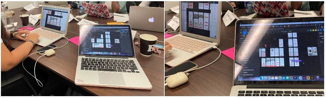
VISUAL / INTERACTION DESIGN
Once the final low-fidelity wireframe was completed, we started to visualize those ideas in the design. We approached creating a simple yet enjoyable design with a bright color palette, clear icons, and layouts. In this stage, I lead the team to create a cohesive, and understandable visual and interaction design for task U.
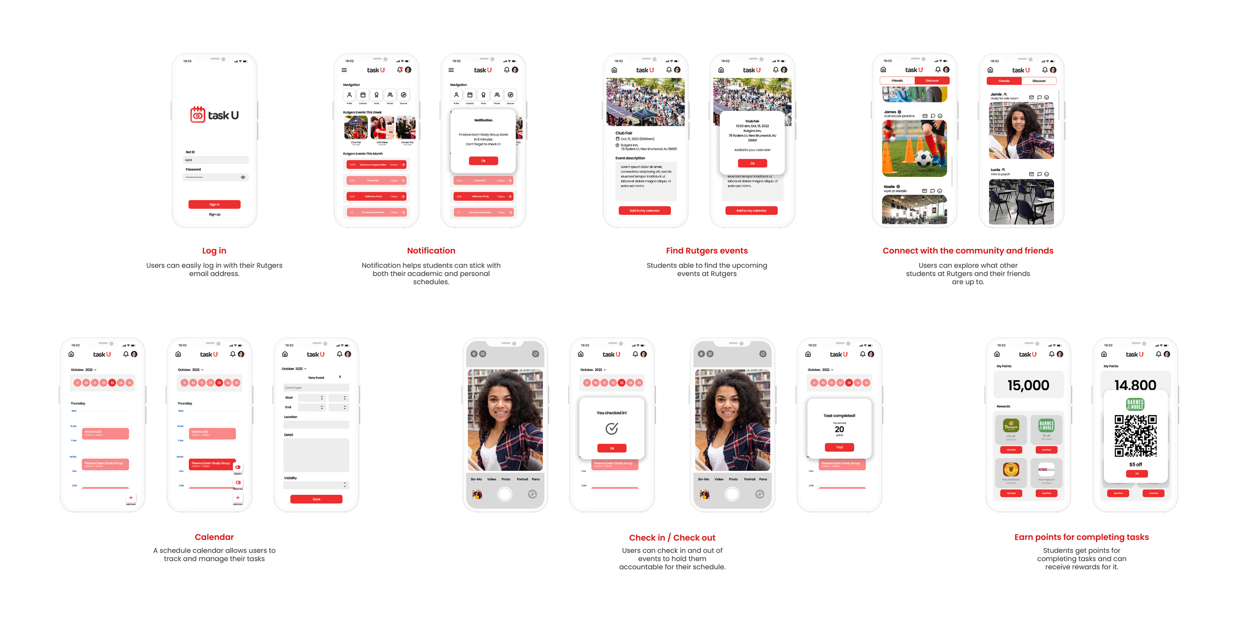
After coming out of our visual design and interface design, we finally built a clickable prototype. Through this process we expected users to navigate Task U's functions smoothly.
USER TESTING
With the prototype we made we conducted a usability test. Through this process, we wanted to observe how users interact with Task U's goals and get results to improve the product better. To get possible insights, we asked participants three main questions.
First, we wanted to know if they understood how to add events and tasks to their personal calendars.
Second, we asked users if they understood how to check in and check out with their scheduled event.
Last but not least, we inquired if users felt encouraged to stay on task.
Our team was able to test our prototype with 5 participants. The user testing was conducted in a private room and each of the team members take the role of facilitator, video recorder, and writer.
We explained scenarios first and ask them to act based on that imagination. Here are some scenarios that participants were tasked to perform.
· You have a finance exam study group today. How would you want to check in on that task?
· If you want to check what kind of events going on Rutgers community, how would you do that?
· You are wondering if your friends doing their tasks. Let's check what are they up to.
DEFINE
Based on the test, there was both positive and negative feedback. Most of the participants successfully did the tasks. They said that the interface design was very well organized as it was easy to navigate to the features.
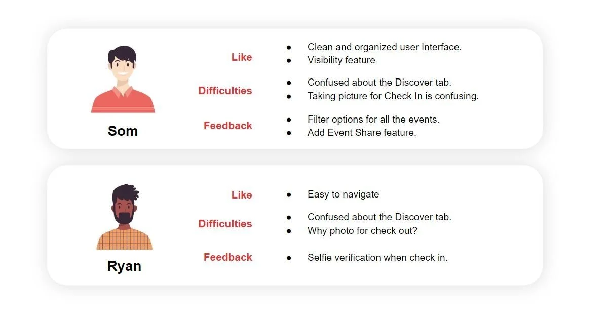
However, there was also some confusion when users performed the tasks. When the participants were asked to look up the event page, they pressed the "Discover" button which shows what the community was doing. Also, some users said taking pictures when checking- in and check-out is too complicated. They understood why that function is necessary for this app but was not familiar with it.
KEY TAKEAWAYS
Overall, the users understood the project objective, and said Task U motivated them to stay on top of academic and personal goals and have better time management. We see this as positive feedback as Task U served the purpose of our intended function.
However, there were still some missing features the users want to use such as sharing the event feature, and filtering options when searching the events. Also, as some users were not familiar with the feature of taking pictures when check-in and check-out, we have to figure out what implementation could be easier to use.
For further improvement of Task U, some next steps would be:
· Improve and provide more functional options.
· Implement a check-in/out feature in a more familiar way.
· Re-visualize some icons and writings to provide better information about the functionality.
· Keep students' well-being with better Task U.
This is my first UX project working with teammates and actual users. It was a great opportunity to take a look at each student's struggles and desires and create possible solutions we can provide. There is still various functionality to be improved but we expect Task U to have the potential that can support students' mental and academic well-being in the real world.